Themes
A theme owns everything about how the form looks: the palette (per-role ANSI style codes) and the glyphs (selectors, markers, carets, separators - each a Unicode/ASCII pair). It never owns what is drawn or in what order - that belongs to the block. A block asks the theme for one element at a time, hands it a plain string and gets a styled one back, so a theme can repaint a breadcrumb but can't reorder one.
Three classes carry the arrangement. AbstractTheme is the floor: it implements every element and declares no capability, so it hands back the strings it was given. DefaultTheme sits on that floor with color, Unicode, a dark/light scheme, markdown, dimming, occupancy and element patching all declared - it's the class most custom themes extend, and a comfortable place to start rather than a requirement. ThemeManager turns a theme name into an instance, and it builds either one.
Built-in themes
Six themes ship built-in, each selectable by name:
use DrevOps\PhpTui\Builder\Form;
use DrevOps\PhpTui\Tui;

$tui = (new Tui(Form::create('My form')))->theme('midnight');
| Name | Palette |
|---|---|
default | Cyan accents on a neutral base - the out-of-the-box look. |
midnight | Violet accents, green values, pink highlights. |
frost | Arctic frost-blue accents, sage values, sand highlights. |
ember | Burnt-orange accents, olive values, gold highlights. |
mono | Hue-free - bold weight, gray levels and reverse video, for maximum compatibility. |
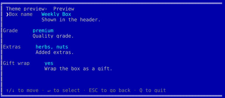
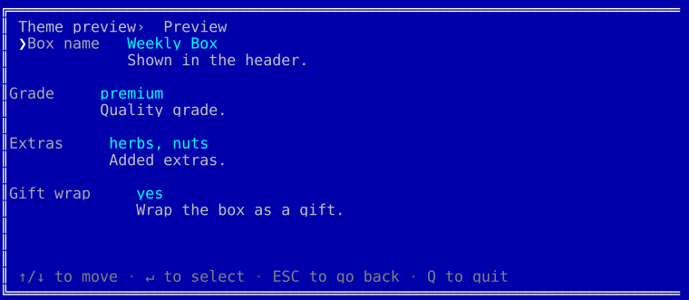
dos | Retro MS-DOS - the bright white/cyan/yellow CGA palette in a double-line window, painted on its own blue screen. |
The colorful themes use 256-color palettes, mono the grayscale ramp and dos the classic 16-color CGA set. Every one renders across all fields and degrades to plain text when color is off. An unknown theme name fails loudly, so a typo never silently lands you back on the default.
Each adaptive theme below is shown in four looks: the dark and light palettes, each rendered once inside the default rounded border and once with the frame explicitly stripped (['border' => 'none']). Every adaptive theme has a runnable script in playground/09-themes-*.
midnight
| Dark | Light | |
| Borderless | 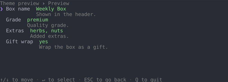 | 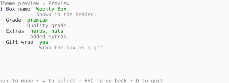 |
| Bordered | 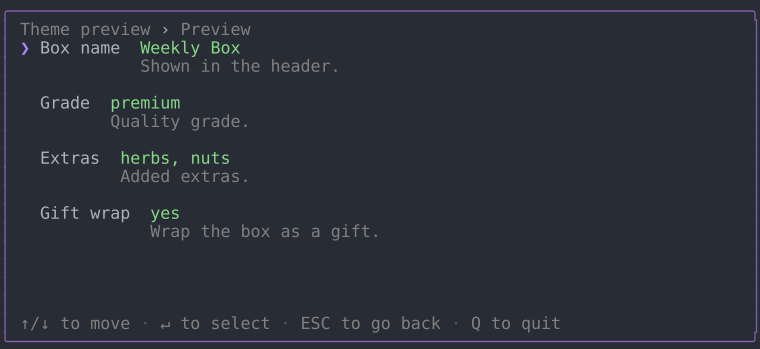 | 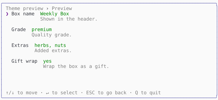 |
frost
| Dark | Light | |
| Borderless | 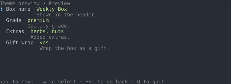 | 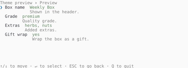 |
| Bordered | 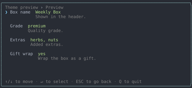 | 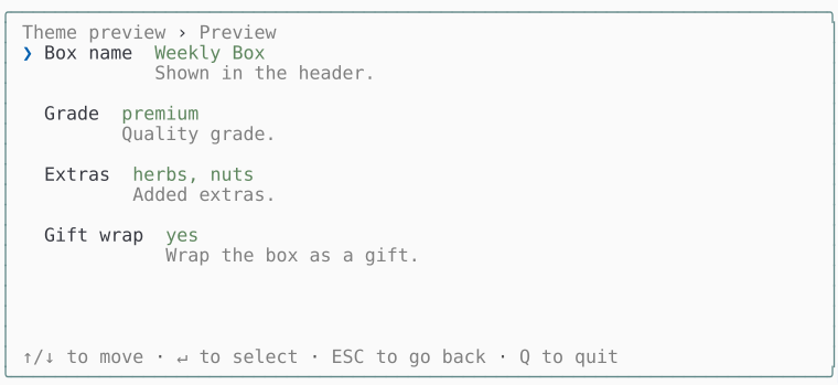 |
ember
| Dark | Light | |
| Borderless | 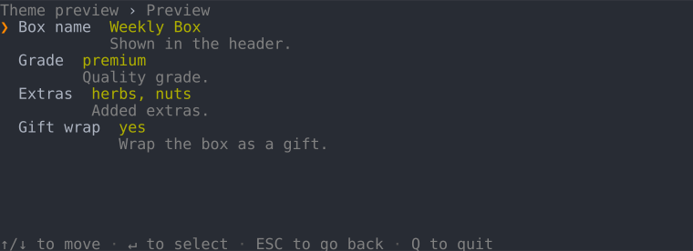 | 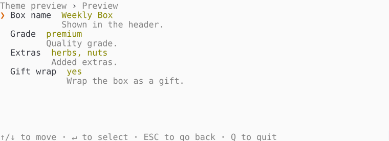 |
| Bordered | 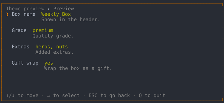 | 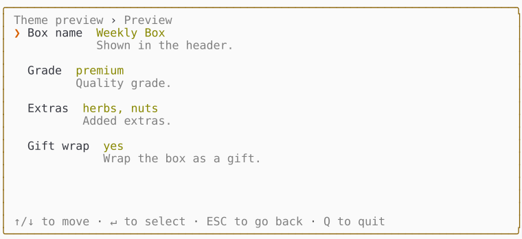 |
mono
| Dark | Light | |
| Borderless | 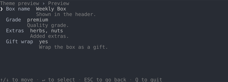 | 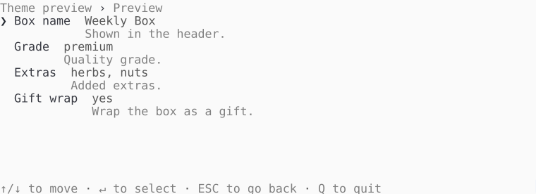 |
| Bordered | 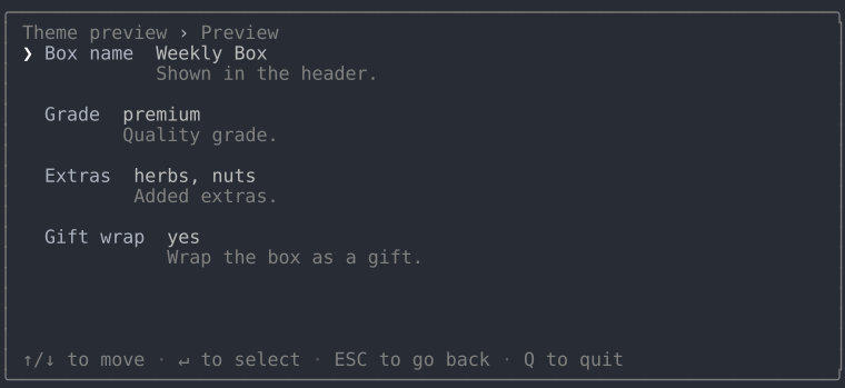 | 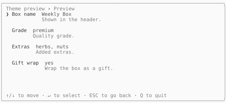 |
dos
The CGA blue screen, painted regardless of the terminal background. The theme draws its own double-line window, so there's no bordered/borderless split - the window is its frame:
Dark and light
Dark and light aren't separate themes - they're a mode display option that every theme honors. Leave mode unset, whichever theme you picked, and the interactive TUI reads it off the actual terminal background: it queries the background color over OSC 11, falls back to the COLORFGBG environment variable, and settles on dark when neither answers. With color off the query is skipped and the mode is dark, since an unpainted palette has nothing to suit.
(new Tui($form))->theme('frost', ['mode' => 'light']);  // force light
(new Tui($form))->theme('frost');                        // auto-detect
Display options
Every theme built on DefaultTheme takes the same options array, validated in its constructor - an unknown key, a value outside the allowed set, or a minimum size above its own maximum throws there, naming what it would accept. A theme built straight on the floor reads no option at all, so it validates none either. These are all of them:
| Option | Values | Does |
|---|---|---|
mode | Mode::Dark, Mode::Light | which palette suits the terminal background; detected when unset |
color | TRUE, FALSE | whether anything paints at all |
unicode | TRUE, FALSE | whether glyphs may reach past ASCII |
markdown | TRUE, FALSE | whether the markdown subset is drawn rather than its markers |
indent_conditional | TRUE, FALSE | whether a conditional field steps in from the answer that reveals it |
spacing | Spacing::Compact, Spacing::Normal, Spacing::Padded | what shows between the rows a region holds |
border | Border::None, Border::Line, Border::Rounded, Border::Double | the frame drawn around everything |
field | FieldStyle::Flat, FieldStyle::Boxed, FieldStyle::Underline | how a field's typed value is drawn in the editor |
fullscreen | TRUE, FALSE | whether the frame takes the whole terminal |
halign | HAlign::Left, HAlign::Center, HAlign::Right | where a frame narrower than the terminal sits across it |
valign | VAlign::Top, VAlign::Middle, VAlign::Bottom | where a frame shorter than the terminal sits down it |
min_width | any non-negative integer | the narrowest terminal the frame can be read in; 0 measures the content |
min_height | any non-negative integer | the shortest terminal it can be read in |
max_width | any non-negative integer | the widest the frame will grow; 0 is uncapped |
max_height | any non-negative integer | the tallest it will grow; 0 is uncapped |
Each enum case is interchangeable with its string value, so ['border' => Border::Rounded] and ['border' => 'rounded'] mean the same thing. A theme can declare options of its own by merging over optionSchema(), and the playground's accent theme is that recipe in fifteen lines.
Writing a theme
A custom theme subclasses DefaultTheme and repaints. Most of what a palette wants is written once, in a small set of protected voices the elements draw from - so a theme repaints a whole family in a line rather than element by element:
| Voice | Says |
|---|---|
accent() | "here", "now" or "picked" - the hue a theme is recognized by |
value() | what something holds |
label() | what something is called |
title() | a name for what follows it |
heading() | a name over a run of rows |
description() | what explains something |
guidance() | what the form expects of you |
footer() | an aside, never the point of the line |
border() | box-drawing characters |
indicator() | something that wants attention without having failed |
error() | something that failed |
use DrevOps\PhpTui\Theme\DefaultTheme;
use DrevOps\PhpTui\Theme\Sgr;

class AquaTheme extends DefaultTheme {

  #[\Override]
  protected function accent(): string {
    return $this->isDark ? Sgr::of(Sgr::Bold, Sgr::Cyan) : Sgr::of(Sgr::Bold, Sgr::Blue);
  }

  #[\Override]
  protected function value(string $text, bool $emphatic = FALSE): string {
    return $this->paint($this->emphasize($this->isDark ? Sgr::of(Sgr::Sky) : Sgr::of(Sgr::Cobalt), $emphatic), $text);
  }

}
Colors come from the Sgr palette map - named cases like Sgr::Cyan or Sgr::Sand, composed with Sgr::of(...) - so a palette reads as colors rather than raw ANSI numbers. paint() wraps text in a style and honors the color switch; emphasize() adds weight to whatever the cursor is on. Midnight, frost and ember are each five overrides of exactly this shape; mono adds a sixth, and dos, which paints its own screen rather than adapting to one, goes further.
The voices are protected on purpose, and that's the boundary worth knowing before you write a theme: the elements are the contract, and everything behind them is the theme's own business. A subclass may lean on accent() or guidance() all it likes, and nothing outside the class may name one - no driver, no block, no test reaches past an element to the palette that painted it. Which is what lets a theme reorganize its palette without breaking a single caller, and why an element is the thing to override when you want a caller to see the difference.
guidance() carries a rule worth knowing before you repaint it. It is the voice that says what the field expects - a bounded list's constraint sits directly under an entry's own explanatory text - so it has to stay apart from description() by color. Weight and italic won't do it: an SVG render drops italic entirely, and so do plenty of terminals. With color off, fieldConstraint() opens the line with a leading mark instead, which is the one cue nothing can strip.
To restyle one piece outright rather than recolor a family, override its element - the public method the block asks for. Anatomy lists every one of them, grouped by the block that declares it:
class AquaTheme extends DefaultTheme {

  #[\Override]
  public function breadcrumbSeparator(): string {
    return $this->glyph('~', '-');
  }

}
The lowest-friction route to using it: name the class directly on the facade, no registration needed:
$tui = (new \DrevOps\PhpTui\Tui($form))->theme(AquaTheme::class);
Or register a short alias with ThemeManager::register('aqua', AquaTheme::class), then ->theme('aqua'). Either way the class must implement ThemeInterface, take a frame width and an options array, and answer for every element a form is drawn from - all of which is what extending AbstractTheme or DefaultTheme gives you - and both naming and registering say so up front rather than failing at the first frame. The playground's ocean theme goes further, repainting many voices and elements for a distinct look with a start banner:
What a theme is allowed to do
A terminal may have no color, no Unicode, or a background the theme should read. A theme declares which of those it handles, and declaring one is what grants the facility that goes with it. Six capabilities exist, and that is the whole set:
| Declaration | Grants | For |
|---|---|---|
ColorSchemeCapableInterface | isColor(), isDark() | painting at all, and picking a palette for a dark or light terminal |
UnicodeCapableInterface | isUnicode() | choosing between a glyph and its ASCII stand-in |
DimCapableInterface | dim() | pushing back what a modal is drawn over |
MarkdownCapableInterface | isMarkdown() | drawing the markdown subset rather than its markers |
OccupyCapableInterface | isFullscreen(), halign(), valign(), the min/max sizes, borderStyle(), spacing(), background() | saying how much of the terminal the frame takes, and where it anchors |
OverrideCapableInterface | overrides() | taking the elements a consumer states differently |
Color and the background are one declaration rather than two, because the two questions are never asked apart: a color is chosen against a background, and a color legible on a dark terminal is not legible on a light one. The border and the air between rows sit with them for the same reason: an edge costs two columns and a rule, so what a frame spends on itself is part of how much of the terminal it takes.
Two of the six carry a trait with the plumbing, so a theme states a flag and inherits the rest. ColorSchemeCapableTrait brings paint() and emphasize(); UnicodeCapableTrait brings glyph(), which is what lets an element write $this->glyph('›', '>') without remembering which display mode it is drawing for.
DefaultTheme declares all six, so a subclass of it inherits every facility and never has to think about this. AbstractTheme declares none: it hands back the strings it was given and the ASCII stand-ins that read without them. That is the floor, and it is why a form renders in a terminal that supports nothing.
A theme built on the floor is selected like any other - ->theme(MyFloorTheme::class), or a short name you registered - because ThemeManager builds anything implementing ThemeInterface from a frame width and an options array. It checks three things where the theme is picked: that the class can be instantiated at all, that its constructor takes a frame width and an options array, and that it implements every element interface the floor does. So a class nothing can build, or one that can't draw a row, is refused by name there rather than partway through a frame - and the set it is checked against is read off the floor rather than written down, so a block added to the library changes what a theme has to draw without anyone maintaining a list. A theme that reaches a frame some other way still can't draw blank: the renderer narrows it to the elements it needs and throws naming both, so ScreenRenderer refuses one without ChromeElementsInterface and every block does the same for its own. What it doesn't declare, the driver does without: no frame is drawn around it, no blank row shows between blocks, nothing recedes behind a modal, and an element patch is dropped rather than deciding the theme can't draw. The output and progress primitives are the exception - a card, a grid and a status line are composed rather than styled, so they want PrimitiveElementsInterface, and a theme without it is named in the error rather than drawn blank.
Patching an element
Restyling a handful of glyphs doesn't need a class at all. Hand ->theme() a closure instead of a name and it is given a ThemeBuilder, whose groups are the blocks that declare the elements - so the prefix is implied, and ->separator() means one thing under ->breadcrumb() and another under ->legend():
use DrevOps\PhpTui\Theme\Override\BreadcrumbOverrides;
use DrevOps\PhpTui\Theme\Override\FieldOverrides;
use DrevOps\PhpTui\Theme\Override\LegendOverrides;
use DrevOps\PhpTui\Theme\Sgr;
use DrevOps\PhpTui\Theme\ThemeBuilder;

$tui = (new Tui($form))
  ->theme('midnight')
  ->theme(fn(ThemeBuilder $t) => $t
    ->breadcrumb(fn(BreadcrumbOverrides $b) => $b->separator('»', '->'))
    ->legend(fn(LegendOverrides $l) => $l->separator('•', '|')->key(Sgr::Bold, Sgr::BrightCyan))
    ->field(fn(FieldOverrides $f) => $f->selector('▶', '=>')->entryMarker('▣', '[x]')->caret('▎', '|')));
The name picks the theme; the closure states what that theme draws differently. The two calls are separate on purpose - one chooses, the other patches - and the patch survives whichever theme is chosen.
A glyph takes two arguments, the mark and its ASCII stand-in, so a patch can't set one display mode and silently leave the other broken. Text takes one, and a color takes Sgr parts in order. Anatomy lists the nine elements this reaches, which is the closed set - naming anything else is a type error rather than a knob that quietly does nothing.
Anything the patch doesn't name keeps the theme's own answer, which is what makes it a patch rather than a replacement. Reach for a subclass when you're changing a palette; reach for this when you're changing a handful of glyphs. Runnable in playground/09-themes-elements.php.